Insurance product UI redesign.
The brief.
A leading health insurance company, that has more than 60,000 employees, excluding contractors, utilizes an internal platform where employees insert new and search for medical claims, patient and providers information and other resources. One of the challenges we encountered with this product was that despite using Pega‚ôs Smart Claims Engine UI, this system was not being used homogeneously across the platform nor was it focused on the best user experience. This was an opportunity for Ascendum to help the company make its platform more cohesive and intuitive for its different users.
Our approach.
The Ascendum Digital team worked closely together with Product Owners, Developers and Managers to understand what were the user needs and how we could to improve this product. Our goal was to ensure a more consistent and better user experience throughout.
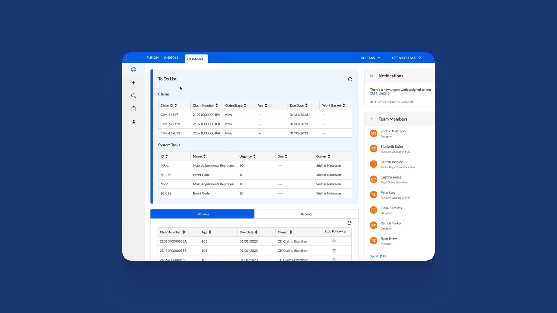
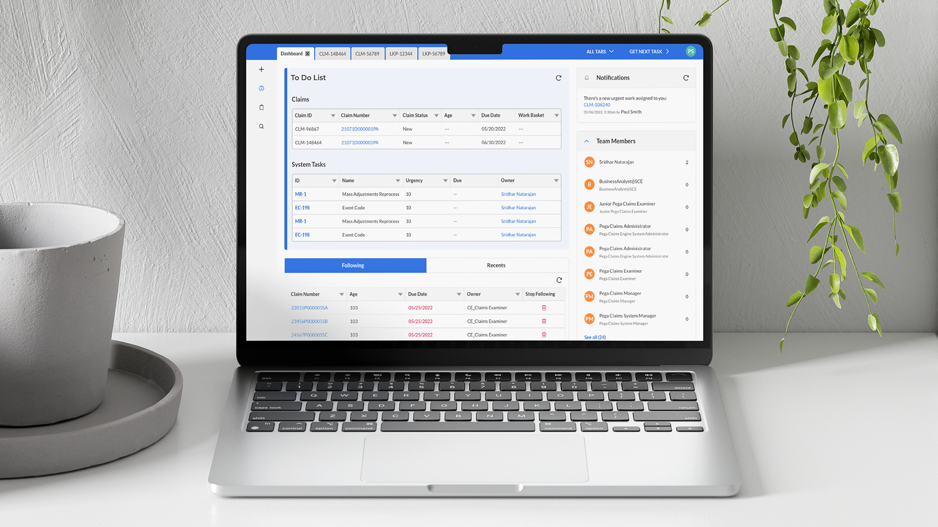
Dashboard
Homepage of the platform that provides a glance of the user To Do List (with open and pending tasks), Notifications section, all Team Members and gives access to all Work Queues Categories.
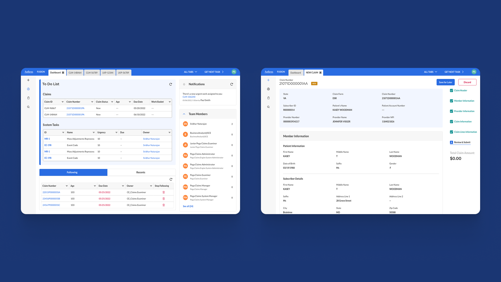
Claims entry
Section where the users can create a new medical claim, inserting all of the necessary details and later submit to the system.
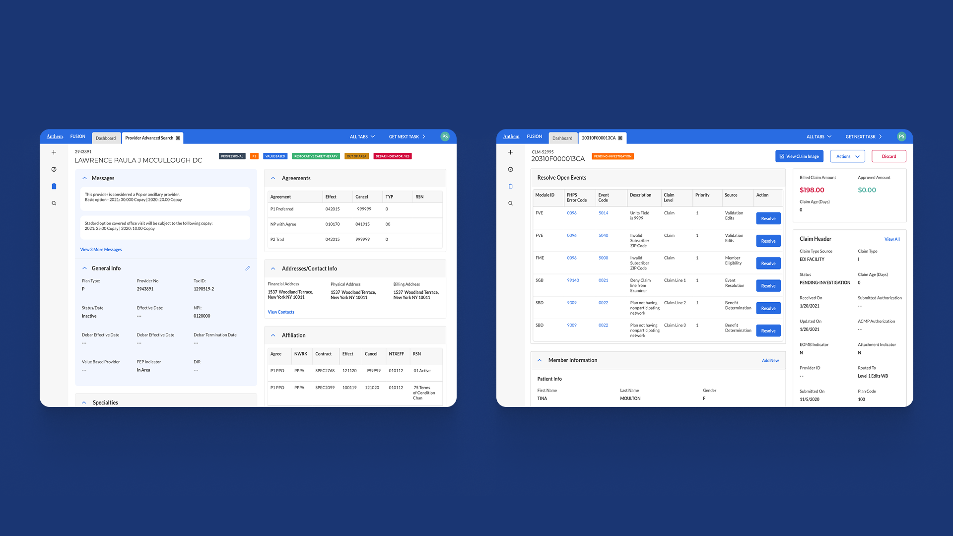
Claims search
Where the user can search for medical claims, provider information, resolve pending claims and view claims history.
Other sections
- Lookups Search
- Medical & State Policy Search
- Pended Claims Resolution.
Our partnership with Ascendum continues to be crucial as they provide great support to our many different digital products and platforms
The outcome.
While using Pega's UI kit, as per the team's requirements, Ascendum Design team reimagined most of this product screens and delivered a redesigned platform with a new fresh look and more organized interface.
- +100 screens redesigned+ introduction to new ideas & solutions
- More human-centered redesign to focus more on the user and its needs
- Improved experience better organized flows & screens


