Retail automation branding.
The brief.
The Curio design team was tasked with crafting a brand identity for a global footwear companies automation integration team, operating within an industry typically lacking visual excitement.
The brief was simply to convey the team's excellence and grant them a distinctive voice in their daily accomplishments and for an event that they were attending. From a brand perspective we took this to mean "make us stand out." To revolutionize the approach, we embarked on the initial challenge of naming.
This creative liberty led to extensive brainstorming, yielding over 100 potential names. A strong name is pivotal in shaping creative execution. It wasn't until we scrutinized the team's abbreviation and functions that we struck gold...
Our approach.
FLAIR is an abbreviation of the companies automation integration team but re-imagined‚ô This expressive name opened a very clear path to how we would approach the design.
We took inspiration from bold, clean and ostentatious design supported by intentionally crafted statements that carry a specific bold tone of voice. We made sure that the brand was about championing the teams talent and daily achievements and ensuring everyone was represented equally.
We wanted to create a winning team culture and one they would be attractive t work with and for and a design that would work over touch points:
Name generation
Over 100 names generated around varying themes. A phase of this was presented back along with favourite.
Logo and brand identity
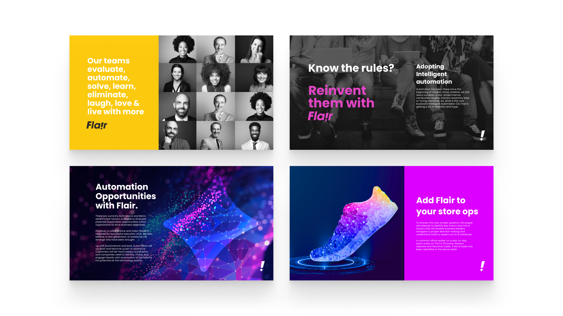
A bold typographic logo supported by visually bold colors, modern team imagery and motion design.
Tone of voice and copywriting
A celebratory and bold tone of voice that champions teams.
Brand guardianship
Guarding the brand application to ensure a consistentand correct application of all the created assets.
Working on Flair was enjoyable, considering the subject category typically lacks visual excitement. The naming was a happy accident & we embraced boldness, engagement, and fun, deliberately deviating from the norm.
The outcome.
The FLAIR brand identity was very well received by the team upon its application to specific touch points. The logo crafted typography with an exclamation mark containing a spark of creative flair.
Intentionally designed to be modern, bold and work in one colour. The spark can also be a team members favourite color expression. The design was referenced as being a stand out branding project for the year and despite a short time frame, the design process yielded impressive and unexpected results.
We're pleased to have provided the teams with a platform to communicate their skills within a specialist and complex tech environment.
This applied to:
Presentations
Extensive branded Figma templates that can be used to present at events, clients and internal teams.
Event materials
Production of specific materials for team events.This included t-shirts, wrist bands and banners.
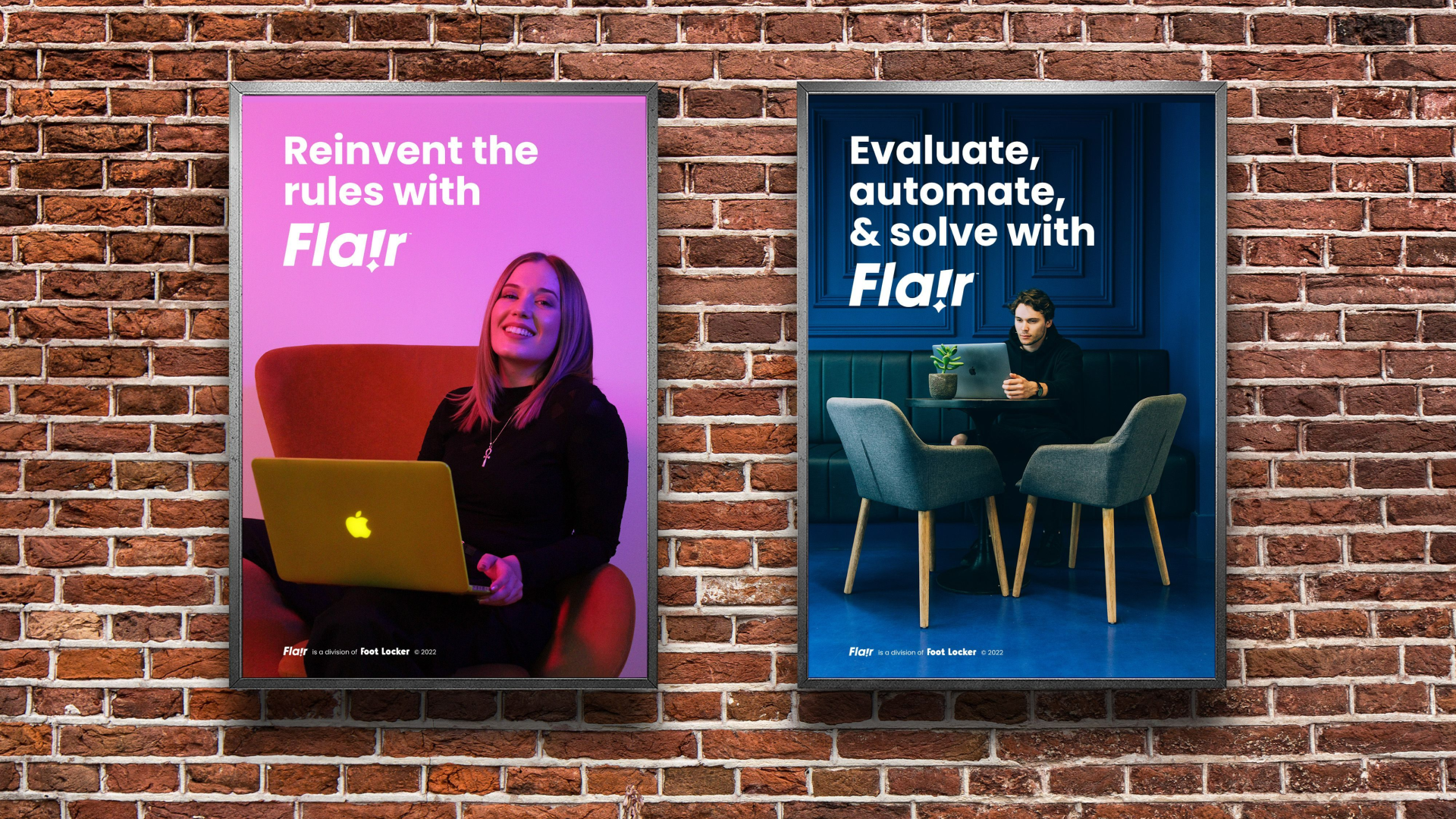
Communications
Posters around events and the office which highlight team achievements and ethos.
Digital brand assets
Supplying assets for items such as email signatures where teams can choose their own FLA!R color.


