A friend meetup app.
The brief.
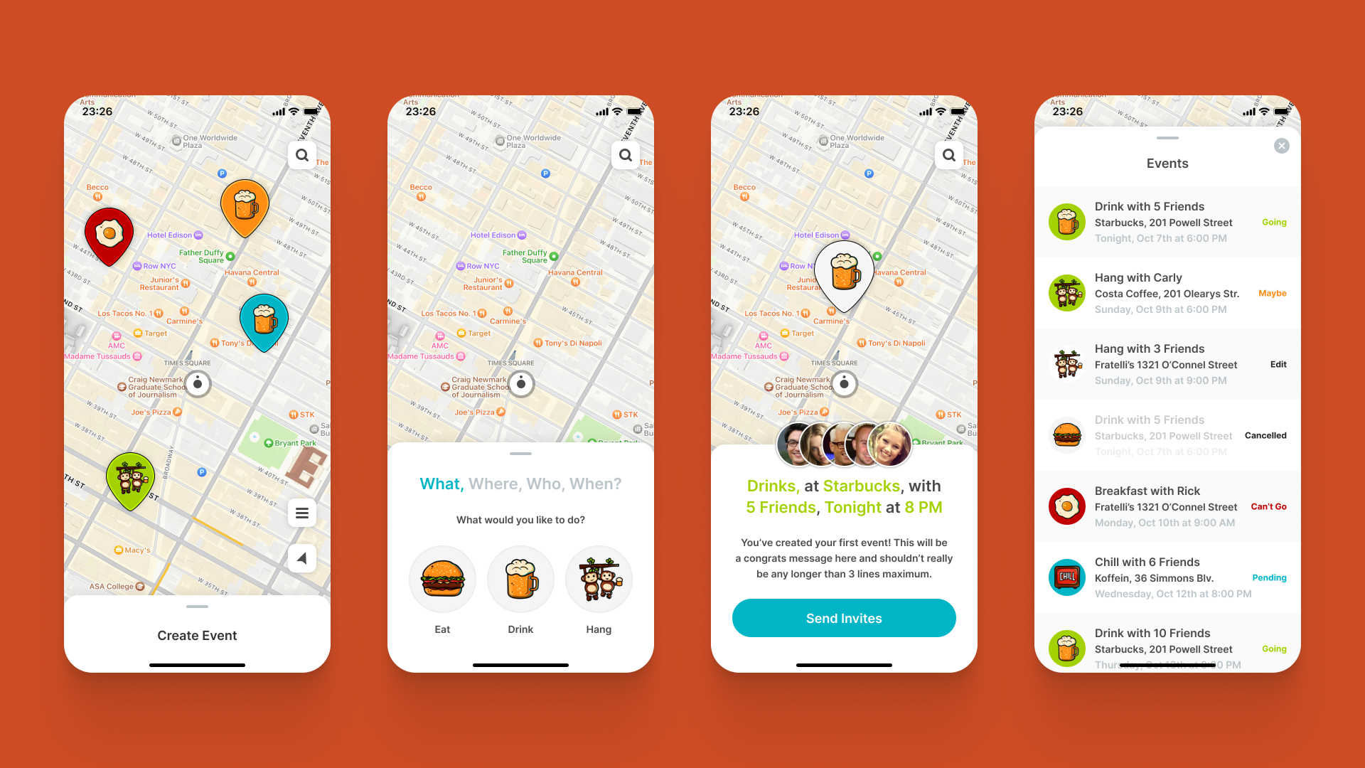
A start-up based in San Francisco needed help to bring their app idea to life. Their mission was to reinvent how people arrange to meetup with their friends. The brand and app UI needed to reflect the location-based nature of the business, whilst also capturing the feel good, fun experience of meeting with friends. Additionally, the app had to be intuitive, providing the ability to arrange a meetup in seconds, yet also accommodating multiple offerings and tailored experiences.
Our approach.
Designing this app we focused on creating a visually engaging onboarding process and a sleek user experience for effortless meetup organization. We crafted unique designs for category icons to inspire distinct visual identity, with each icon contributes to the app's overall appeal and user experience.
This was highly creative project and a lot of fun for us. We had the freedom to explore, and the client's laid-back approach made the process enjoyable. They loved our work, making it a fantastic experience all around!
The outcome.
The app is centered on simplifying meetup creation with a straightforward process that guides users through minimal steps and tracks progress in real-time. We've improved user interaction by offering clear response options (yes, no, or maybe) for invitees. The client's appreciation for our unique illustrations highlights the creativity and satisfaction we brought to the design process.
Eye-candy onboarding
The end result showcases a new and unique visual design, presenting a cohesive and distinct identity.
Sleek UX for easy meetups
A sleek user experience was our top priority in designing the app, ensuring a seamless process for organizing meetups with friends.
Hand-drawn illustrations
We infused the app with unique, hand-drawn illustrations to give each category its own personality and visual appeal.


